The editor settings control the behavior of your editor UX, in particular:
- Multi-Language UI
- User menu
- Main navigation
- Dashboards
- Start page
- Document creation flow
- Media library
- Document lists
- Inline links
- Text formatting
An example:
editorSettings: {
  userMenu: [
    {
      label: 'What is new',
      data: {
        lastUpdate: '2020-06-16T13:19:38.560Z'
      },
      icon: 'plus',
      id: 'release_notes',
      group: 'string:required',
      // Use either 'href' (external link) or 'route' (internal link)
      href: 'https://github.com/livingdocsIO/livingdocs-release-notes',
      route: {
        name: 'app.state'
      }
    }
  ],
  mainNavigation: [
    {liItem: 'articles'},
    {liItem: 'pages'},
    { // custom document dashboard
      handle: 'authors',
      label: 'Authors',
      dashboard: 'authors-dashboard',
      icon: 'account'
    },
    { // custom task dashboard
      handle: 'proofreading',
      label: 'Proofreading',
      dashboard: 'kanban-proofreading',
      icon: 'clipboard-check'
    },
    {liItem: 'mediaLibrary'},
    {liItem: 'lists'},
    {liItem: 'menus'},
    {liItem: 'contentSetup'},
    { // external link
      handle: 'website',
      label: 'Livingdocs Website',
      href: 'https://www.livingdocs.io',
      icon: 'rocket',
      group: 'preferences' // Used for grouping before release-2022-03
    },
    {liItem: 'projectSettings'},
    {liItem: 'serverAdmin'}
  ],
  mainNavigationGroups: [
    {
      handle: 'documents',
      label: 'Documents',
      // items is an array of liItem or handle strings
      items: [
        'articles',
        'pages',
        'authors'
      ]
    },
    {
      handle: 'mediaLibrary',
      label: 'Media Library',
      items: ['mediaLibrary'] // Media library types are split, but remain in the same group
    },
    {
      handle: 'workflow',
      label: 'Workflow',
      items: ['proofreading'] // Using the handle of the custom mainNavigation menu item
    },
    {
      handle: 'content-management',
      label: 'Content Management',
      secondary: true, // Group uses a grey background and is collapsed by default
      items: [
        'lists',
        'menus'
      ]
    },
    {
      // No label property makes the group non-collapsible, and appear like top-level items
      handle: 'website',
      secondary: true,
      items: ['website']
    },
    {
      handle: 'preferences',
      label: 'Settings', // Update the label name of the preferences group
      secondary: true,
      items: [
        'contentSetup',
        'projectSettings',
        'serverAdmin'
      ]
    }
  ],
  dashboards: [
    {
      handle: 'kanban-proofreading',
      type: 'taskBoard',
      pageTitle: 'Proofreading',
      taskName: 'proofreading',
      throttleTime: 2000, // ms
      displayFilters: ['documentState', 'timeRange']
    },
    {
      handle: 'authors-dashboard',
      type: 'dashboard',
      pageTitle: 'Author Management',
      entityLabel: 'Author',
      baseFilters: [
        {key: 'documentType', value: 'data-record'}
      ],
      displayFilters: ['documentState', 'timeRange'],
      sort: '-updated_at',
      fields: ['metadata.*'],
      componentName: 'bluewinDashboardListItem'
    }
  ],
  // you can define configured cards here, they can then be referenced
  // within a mediaType defining the card to be used for rendering in a dashboard
  dashboardCardConfigurations: [
    {
      handle: 'myImageCard',
      useCard: 'liMediaLibraryCard',
      options: {
        additionalInfo: [
          {
            metadataPropertyName: 'credit'
          }
        ]
      }
    },
    {
      handle: 'myVideoCard',
      useCard: 'liMediaLibraryCard',
      options: {
        additionalInfo: [
          {
            metadataPropertyName: 'credit'
          }
        ]
      }
    }
  ],
  // The startPage config has no effect if a home screen is configured in the same project.
  startPage: {
    path: '/articles'
  },
  mediaLibrary: {
    showUi: true, // default true
    altTextPrefilling: [
      {
        metadataPropertyName: 'caption',
        onlyOnComponents: ['image']
      }
    ],
    componentDirectivesPrefilling: [
      {
        metadataPropertyName: 'source',
        directiveName: 'image.source' // Component prefix
      },
      {
        metadataPropertyName: 'caption',
        directiveName: 'caption' // Applies to all components with a caption directive
      }
    ]
  },

  documentLists: {
    card: {
      name: 'liDocumentListCard' // default, can be omitted
    },
    dashboard: {
      displayFilters: [],
      baseFilters: []
    }
  }

  // Note: the textFormatting config can be overwritten in a `contentType`
  textFormatting: {
    bold: true,
    italic: true,
    superscript: false,
    subscript: false,
    link: true,
    specialChars: true,
    quotes: ['„', '“']
    singleQuotes: ['‚', '‘']
    apostrophe: '’',
    locales: {
      de: {
        quotes: ['„', '“'],
        singleQuotes: ['‚', '‘']
      },
      en: {
        quotes: ['“', '”'],
        singleQuotes: ['‘', '’']
      }
    }
  }
}
Multi-Language UI
Configure UI languages(s) in editor:
app: {
  locale: 'de',
  availableLocales: ['de', 'en', 'fr', 'it']
}
For more details see the Multi-Language UI guide.
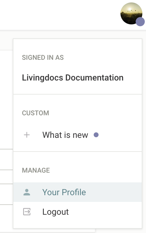
User Menu
Makes it possible to configure custom entries within the Livingdocs user menu. If given a userMenu.data.lastUpdate property, it will visually indicate changes to the user. While you can add additional menu items, it is not possible to remove or alter the default Livingdocs menu items.
Main Navigation
The main navigation menu items are configured using the mainNavigation array. Within this array you can either specify a predefined liItem, link to a custom dashboard, or link to an external page. If the mainNavigation array is not provided then all core liItem menu items will be added by default.
liItem
The possible values for liItem are: articles, pages, dataRecords, mediaLibrary, proofreading, lists, menus, tags (imatrics), contentSetup, projectSettings, and serverAdmin (enterprise only).
For each item you can either use the default properties defined by Livingdocs:
editorSettings: {
  mainNavigation: [
    {liItem: 'articles'}
  ]
}
Or you can overwrite any of the default values:
{
  liItem: 'articles',
  label: 'Articles',
  icon: 'file-document',
  scope: 'readArticles'
}
Custom Dashboard
To link to custom dashboards you can provide the handle of your custom dashboard in the dashboard property:
{
  label: 'My Custom Dashboard',
  dashboard: 'my-custom-dashboard',
  icon: 'clipboard-check',
  scope: 'publishArticles'
}
The shorthand liItem: 'proofreading' can be used to point to a dashboard named kanban-proofreading.
External Link
To link to an external page you should set the href property:
{
  label: 'Livingdocs',
  href: 'https://livingdocs.io',
  icon: 'web'
}
Customizing menu items
You can customize the scopes that you assign to a menu item to control access rights. Menu items that the user does not have access to will be hidden. See all available scopes.
You can also customize the icons by providing an icon string. Please see the Icons guide for further details of the icons available.
To remove an entry, simply delete it from the mainNavigation array. If you have not defined the mainNavigation array, and are relying on the core menu items, then you will need to configure the array with the menu items you would like to include.
Main Navigation Groups
To create custom groups for menu items you can use the mainNavigationGroups configuration. Within this array you should create an object for each group, and then define the menu items which belong to it by adding their handle or liItem value as a string in the items array. A group handle should be defined, and it’s also possible to provide a label string, and to change the style by setting the boolean secondary property.
By default the main navigation items will be placed as top-level items in the menu, with the exception of ‘contentSetup’, ‘projectSettings’, and ‘serverAdmin’, which will be added to the ‘preferences’ and ‘admin’ groups.
editorSettings: {
  mainNavigation: [
    // ...
  ],
  mainNavigationGroups: [
    {
      // Simple group linking to liItem menu items
      handle: 'documents',
      label: 'Documents',
      items: [
        'articles',
        'pages',
        'authors'
      ]
    },
    {
      // The {liItem: 'mediaLibrary'} will be split into a separate dashboard for each media type
      handle: 'media',
      label: 'Media Library',
      items: ['mediaLibrary']
    },
    {
      // A group for custom workflow dashboards
      handle: 'workflow',
      label: 'Workflow',
      items: ['proofreading', 'review']
    },
    {
      // Top-level external link (no label)
      handle: 'website',
      secondary: true, // Grey background
      items: ['website']
    },
    {
      // Merge the admin and preferences groups, and change the label name
      handle: 'preferences',
      label: 'Settings',
      secondary: true,
      items: [
        'contentSetup',
        'projectSettings',
        'serverAdmin'
      ]
    }
  ]
}
For releases prior to release-2022-03 you should specify a group property on the menu item within the mainNavigation array. The available values are ‘admin’, ‘preferences’, ‘dashboards’, ‘custom’, and ’top’.
Dashboards
The dashboards entry allows you to configure custom dashboards, e.g. for authors (data-records) or proofreading (tasks).
There are 4 types of custom dashboards (type property):
dashboardkanbanBoardtaskBoard(predefinedkanbanBoardfor a task)tableDashboard
Kanban Boards are very similar to dashboards, except for having multiple result columns. Each result column shows a list of documents just as a single column dashboard does. The documents cannot be manually sorted or moved between columns, instead each column typically has its own filter settings.
For example a task board will show all tasks in the requested state in one column and tasks with the state inProgress and done in the other columns. In order to move a card into another column you simply have to open the document and move the task into another state.
Common Dashboard Properties
Custom dashboards have some basic properties in common which are described in more detail below.
handle
Identifier for a custom dashboard. It’s also used as a reference for the main navigation
type
Type of the dashboard, one of these: dashboard, kanbanBoard, taskBoard, tableDashboard
displayFilters
Display Filters are filters that the user can set in the UI (below the search input).
With release-2021-03 the displayFilters for the Media Library Dashboards are defined on the Media Type.
baseFilters
Base Filters are invisible filters and applied to every search (including the default result list).
With release-2021-03 the baseFilters for the Media Library Dashboards are defined on the Media Type.
sort
It’s a shorthand to define sortBy properties applied to baseFilters.
Defines the order of the elements in a dashboard.
Possible values are:
-updated_at/updated_at(Default),-created_at/created_at,title- any metadata property e.g.
metadata.proofreading.priority
When a query string is present, sorting is defined by the relevance with the search term.
Example: Dashboard
dashboards: [
  {
    handle: 'gallery-dashboard',
    type: 'dashboard',
    pageTitle: 'Gallery Board',
    // Label used to describe the documents in this Dashboard
    entityLabel: 'Article',
    // Invisible base filters applied to every search (including the default result list)
    baseFilters: [{key: 'documentType', term: 'article'}],
    // Filters shown to the user below the search input
    displayFilters: ['documentState', 'timeRange'],
    sort: '-updated_at',
    // fields to be returned from the server (not all metadata fields are returned by default)
    fields: ['metadata.*'],
    // Enterprise only: This is the name of the vue component used in the result list
    componentName: 'liHeroCard',
    // Enterprise only: The componentOptions are injected into the component
    // `liHeroCard` (in this example)
    componentOptions: {teaserImage: 'teaserImage'},
    // Enterprise only: CSS class set as a wrapper around the result list
    cssWrapper: 'li-result-columns'
  }
]
Example: Taskboard (simple config)
dashboards: [
  {
    handle: 'kanban-proofreading',
    type: 'taskBoard',
    pageTitle: 'Proofreading',
    // This is the name of a metadataProperty of `type: 'li-task-v2'`
    taskName: 'proofreading',
    displayFilters: ['documentState', 'timeRange']
  }
]
Example: Kanbanboard (full config)
dashboards: [
  {
    handle: 'kanban-proofreading',
    type: 'kanbanBoard',
    pageTitle: 'Proofreading',
    // Label used to describe the documents in this KanbanBoard
    entityLabel: 'Article',
    displayFilters: [],
    // Base filters are applied to all columns
    baseFilters: [{key: 'documentType', term: 'article'}],
    // This is the name of the angular component to use in all columns
    // (can also be defined for each columns separately)
    componentName: 'liTaskCard',
    // include all metadata properties in the search response data
    fields: ['metadata.*'],
    // Set the target when clicking on a card. Currently supported:
    // - 'article' (default setting)
    // - 'tasks'
    openState: 'tasks',
    showFooter: true,
    columns: [
      {
        handle: 'requested',
        label: 'Needs Proofreading',
        // Filter applied for this column on top of the `baseFilter`
        columnFilter: [
          {key: 'metadata.proofreading.state', term: 'requested'}
        ],
        sort: [`metadata.proofreading.priority`, `metadata.proofreading.deadline`],
        // The componentOptions are injected into the component `liTaskCard` (in this example)
        componentOptions: {column: 'todo', taskName: 'proofreading'}
      },
      {
        handle: 'in-progress',
        label: 'In Progress',
        columnFilter: [
          {key: 'metadata.proofreading.state', term: 'accepted'}
        ],
        sort: [`metadata.proofreading.priority`, `-metadata.proofreading.accepted.date`],
        componentOptions: {column: 'doing', taskName: 'proofreading'}
      },
      {
        handle: 'done',
        label: 'Finished Proofreading',
        columnFilter: [
          {key: 'metadata.proofreading.state', term: 'completed'}
        ],
        sort: [`-metadata.proofreading.completed.date`],
        componentOptions: {column: 'done', taskName: 'proofreading'}
      }
    ]
  }
]
Example: Table Dashboard
dashboards: [
  {
    handle: 'example-table-dashboard',
    type: 'tableDashboard',
    pageTitle: 'Table Dashboard Title',
    baseFilters: [
      {key: 'documentType', term: 'article'}
    ],
    displayFilters: [
      'channels',
      'documentState',
      'contentType',
      'timeRange',
      'language',
      'category'
    ],
    sort: '-updated_at',
    columns: [
      {
        label: 'Title',

        minWidth: 100,  // minimum width in pixels

        growFactor: 1,  // share of the remaining space after
                        // minWidth of all columns has been allocated
                        // (works like flex-grow in CSS)

        priority: 1,    // If there is not enough space for all columns
                        // keep those with priority 1, then 2, etc.

        // Name of the Vue component used for this column
        componentName: 'liTableDashboardCellMain',

        // Custom options passed to the above component
        componentOptions: {
          image: {
            metadataPropertyName: 'teaserImage'
          },
          clampTitle: false,
          showContentType: true
        }
      },
      {
        label: 'Description',
        minWidth: 200,
        growFactor: 3,
        priority: 3,

        // Columns can also display a metadata property instead of using a custom component
        metadataPropertyName: 'description',

        // default false, if true, metadata property can be edited inline in the dashboard
        editable: true
      }
    ],

    // adds a Document Creation Flow to the dashboard (e.g. custom button, custom create modal, custom create function)
    documentCreationFlows: [
      {useDocumentCreationFlow: 'breakingNews'}
    ]
  }
]
Supported metadata properties
The following metadata plugin types are supported in the table dashboard:
li-booleanli-textli-categoryli-document-referenceli-string-listli-desknet-integrationli-integer(Added in:release-2023-03)
Upstream components
liTableDashboardCellMain
The liTableDashboardCellMain upstream component can be used to display document thumbnail, title, content type, and last modification / author:
Options:
componentOptions: {
  image: {
    // Name of metadata property to be used for thumbnail image
    metadataPropertyName: 'teaserImage'
  },
  // Clamp title to max 3 rows
  clampTitle: false,
  // Show content type tag
  showContentType: true,
  // Only works if no displayTitlePattern is configured on the contentType
  allowTitleEdit: true

}
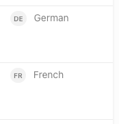
liTableDashboardCellLanguage
The liTableDashboardCellLanguage upstream component can be used to display the document language:
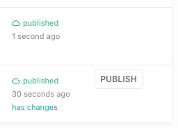
liTableDashboardCellPublishState
The liTableDashboardCellPublishState upstream component can be used to display publish state and quick publish button
(only shown if metadata has been edited directly within the table dashboard).
With release-2023-05 and following, allowQuickPublish: true is required to show the quick publish button.
{
  label: 'Published',
  minWidth: 200,
  growFactor: 0,
  priority: 2,
  componentName: 'liTableDashboardCellPublishState',
  componentOptions: {
    allowQuickPublish: true
  }
},
liTableDashboardCellTaskList
Added in: release-2023-03
The liTableDashboardCellTaskList gives an overview of current tasks connected with the given document.
columns: [
  ...,
  {
    label: 'Tasks',
    editable: false,
    minWidth: 150,
    growFactor: 0,
    priority: 2,
    componentName: 'liTableDashboardCellTaskList',
    componentOptions: {
      tasks: ['proofreading'] // filter which tasks to show
    }
  }
]
Custom components
Custom components of type tableDashboardCell can be used to render custom content inside a table cell.
startPage
Set custom startPage: {path: '/my-custom-path'}} to set the path used to render on login or when switching projects.
Notice: The startPage config will have no effect if a home screen is configured in the same project.
Home Screen
When configured on a project, the home screen will be the start page on login or when switching projects.
Notice: The startPage config will have no effect if a home screen is configured in the same project.
The home screen can display multiple Table Dashboard on the same page and has Document Creation Flow buttons in the main toolbar.
// projectConfig.editorSettings
homeScreen: {
  dashboards: [
    {
      // Handle of the dashboard to show
      useDashboard: 'articles',
      // Hides the dashboard search input field (optional, default: false)
      hideSearchInput: true,
      // Title to show over the dashboard (optional, default: dashboard.pageTitle)
      dashboardTitle: 'Recommended Articles',
      // Use a custom dashboard source (see dashboard sources documentation below)
      dashboardSourceHandle: 'recommendedArticlesSource'
    },
    {
      useDashboard: 'example-table-dashboard'
    }
  ],
  documentCreationFlows: [
    {
      // Handle of a Document Creation Flow
      useDocumentCreationFlow: 'articles'
    },
    {
      useDocumentCreationFlow: 'breakingNews',
      // Render as primary button
      primary: true
    }
  ]
}
Dashboard Sources
Dashboards on the home screen are eligible of using Dashboard Sources. This means the Table Dashboards can display documents, that are not returned by the regular document search. A use case for this could be a personalized list of recommended articles that are determined by custom queries or even an external system.
Limitations:
- No display filters or base filters available
- Maximum number of results are limited to 35
- No pagination supported
Document Creation Flow
With a Document Creation Flow you can define how a document gets created (e.g. create button for a Dashboard).
Check that guide for more information.
// projectConfig.editorSettings
documentCreationFlows: [
  {
    handle: 'breakingNews',
    // register a createFunction with liServer.registerCreateFunction()
    // default createFunction handle: 'liDefaultCreationFunction'
    createFunction: 'breakingNews',
    createButtonLabel: 'Create Breaking News',

    // shows title and urgency field in the create modal
    // the config is the same as for metadata plugins
    paramsSchema: [
      {handle: 'title', type: 'li-text'},
      {handle: 'urgency', type: 'li-number'},
    ],

    // values passed to paramsSchema fields as initial value
    defaultParams: {
      urgency: 5
    },

    // additional info for your createFunction
    context: {
      projectType: 'flex',
      contentType: 'regular'
    }
  }
]
Media Library
Dashboards
If you linked the media library on the mainNavigation (see above), Livingdocs automatically inserts separate dashboards per type (mediaImage/mediaVideo/mediaFiles).
You will only see the dashboards for the individual mediaTypes you have configured.
See Media Type documentation for more information.
Dashboard Cards
You can configure the card used to show results in dashboards. You do this by configuring your own dashboard card in the project config under editorSettings.dashboardCardConfigurations and then define this card per mediaType as you please.
// projectConfig.editorSettings

dashboardCardConfigurations: [
  {
    handle: 'myImageCard',
    useCard: 'liMediaLibraryCard',
    options: {
      // will make the card show the credit information from the metadata of the mediaLibraryEntry
      additionalInfo: [
        {
          metadataPropertyName: 'credit'
        }
      ]
    }
  },
  {
    handle: 'myDocumentListCard',
    useCard: 'liDocumentListCard',
    options: {
      // the liDocumentListCard supports the rendering of an additional Vue component
      // inside. This component is configured here, it has to be registered with the vueComponentRegistry
      uiExtensionComponent: {
        name: 'liDocumentListCardExtensionRocket'
      }
    }
  }
]
This will define a card myImageCard to be used in mediaType.editor.dashboard.card.name. See the See Media Type config example.
Prefilling Behavior
Then there are 2 configs to define the behavior when Images are inserted into a Document from the Media Library:
Alt Text Prefilling
mediaLibrary.altTextPrefilling: [
  {
    metadataPropertyName: 'title',
    onlyOnComponents: ['image']
  }
]
Provide a metadata property handle from which the alt attribute on an image tag is filled. This value will also be stored within the document content using the altText property on the directive content. To limit the prefilling to a subset of components you can optionally provide an array of component names using the onlyOnComponents property. Providing multiple objects within the array will allow you to have fallbacks when the metadata property has no value, or to specify different properties for different components.
Component Directives Prefilling
mediaLibrary.componentDirectivesPrefilling: [
  {
    metadataPropertyName: 'source',
    directiveName: 'image.source' // Component prefix
  },
  {
    metadataPropertyName: 'caption',
    directiveName: 'caption' // Applies to all components with a caption directive
  }
]
An array of mappings to prefill doc-editable directives with Media Library Entry Metadata. The metadata value must be a string. The directive name can be prefixed with a component name to limit where the prefill will be used, for example “image.source”. To limit the prefilling to multiple components you will need to add multiple objects to the array.
Document Lists
documentLists: {
  card: {
    // defaults to liDocumentListCard provided by Livingdocs
    // can be any card registered in the vueComponentRegistry or
    // a configured one from dashboardCardConfigurations
    name: 'myDocumentListCard'
  },
  dashboard: {
    useDashboard: 'myCustomDashboard'
    displayFilters: [],
    baseFilters: [
      {key: 'documentType', term: 'article'},
      {key: 'lastPublicationId', exists: true}
    ]
  }
}
Inline Links
inlineLinks: {
  dashboard: {
    useDashboard: 'myCustomDashboard'
    displayFilters: [],
    baseFilters: [
      {key: 'documentType', term: 'article'},
      {key: 'lastPublicationId', exists: true}
    ]
  }
}
useDashboard
useDashboard defines which dashboard is going to be renderered when the user clicks on Extended Search.
displayFilters
Display Filters are filters that the user can set in the UI (below the search input).
baseFilters
Base Filters are invisible filters and applied to every search (including the default result list).
Anchor Links
To enable anchor linking (link to a section within a document), configure editable directives in design settings.
Text Formatting
The text formatting toolbar can be customized globally here. You can also overwrite this config for each content type.
Enable or disable the existing elements for text formatting:
textFormatting: {
  bold: true,
  italic: true,
  superscript: false,
  subscript: false,
  link: true,
  specialChars: false,
  quotes: ['„', '“'],
  singleQuotes: ['‚', '‘'],
  apostrophe: '’',
  locales: {...}
}
Extend the text formatting toolbar with custom configured elements. The elements will be shown after the default elements. Add this configuration to the textFormatting configuration above.
 customElements: [
  {
    label: 'blue color',
    handle: 'bluecolor',
    // if trim is set to true, whitespaces on the left and right of the selection are removed
    trim: true,
    // the tag which is set around the selection
    tagName: 'span',
    // the icon which will be displayed. Only existing icons in the editor can be used.
    icon: 'format-color-highlight',
    // the attributes which are set on the tag
    attributes: [{name: 'class', value: 'blue'}]
  }
]
Following attribute types can be added to a customElement:
static value
e.g. add to the class attribute on the customElement the value blue
{name: 'class', value: 'blue'}li-reference
Deprecated in:
release-2023-09Removed in:
Users can link a document. The attribute name is alwaysrelease-2023-11data-li-document-ref. And the references are extracted as with a normal link to a document.{ label: 'author link', handle: 'authorlink', tagName: 'span', icon: 'file-link', attributes: [ { handle: 'documentref', type: 'li-reference', config: {referenceType: 'document', contentType: 'author'} } ] }li-document-reference
Added in:
Users can link a document. The attribute name is alwaysrelease-2023-07data-li-document-ref. And the references are extracted as with a normal link to a document.{ label: 'author link', handle: 'authorlink', tagName: 'span', icon: 'file-link', attributes: [ { handle: 'documentref', type: 'li-document-reference', config: {contentType: 'author'} } ] }li-enum
Users can select a value from a list
{
  handle: 'specialprovider',
  type: 'li-enum',
  name: 'data-specialprovider',
  config: {
    dataProvider: {
      handle: 'specialprovider',
      type: 'labelValuePair',
      items: [
        {label: 'Batman', value: 'batman'},
        {label: 'Alfred', value: 'alfred'},
        {label: 'Robin', value: 'robin'},
        {label: 'Riddler', value: 'riddler'},
        {label: 'Joker', value: 'joker'},
        {label: 'Penguin', value: 'penguin'},
        {label: 'Mr. Freeze', value: 'freeze'}
      ]}
  }
}
li-text
Users can add a text value by themself
{
  label: 'input',
  handle: 'input',
  tagName: 'span',
  icon: 'format-color-highlight',
  attributes: [
    {
      handle: 'input',
      type: 'li-text',
      name: 'data-input'
    }
  ]
}
Restrictions
There can be only one attribute with a type in the attributes array. Static values can be added as many as needed.